
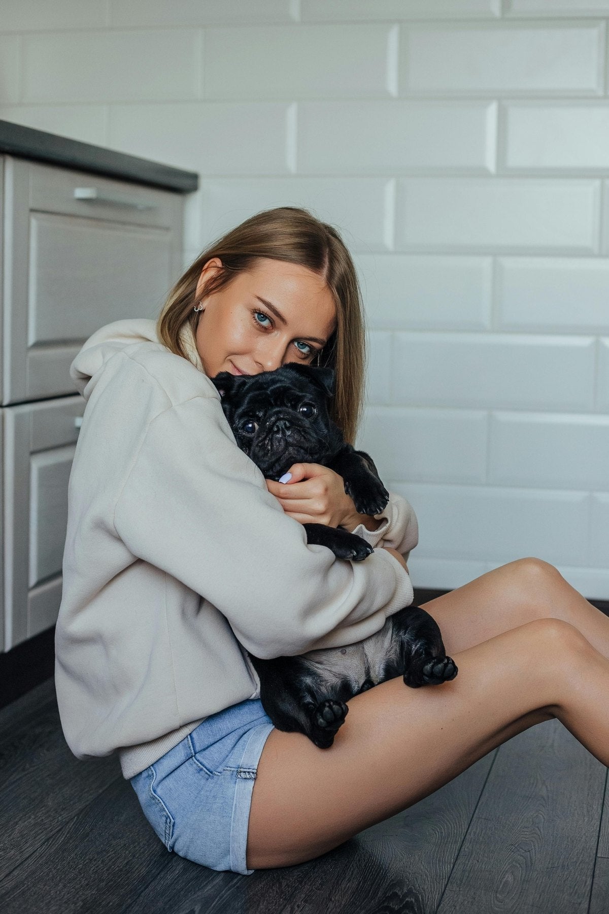
LuminaBright, clear, balanced
Choose for: airy portraits, engagement photos, bright rooms, clean family memories.
Watch for: very dark scenes may need a richer palette.

Have an account? Log in to check out faster.
Style guideCreative direction guide
Use this page like a calm creative guide. Start with the feeling of the photo, then choose the palette and surface style that will shape the piece you paint, gift, or display.
Start with the kind of photo you love
A pet portrait, a family moment, a quiet home scene, and a warm still life should not all ask for the same rhythm. Use the guide below to match the source photo to a palette and surface style that supports both the subject and the painting experience.


Which palette should I choose?
Each palette changes the feeling of the same photo, from soft and calm to rich and bold.
Choose for: airy portraits, engagement photos, bright rooms, clean family memories.
Watch for: very dark scenes may need a richer palette.

Choose for: pets, keepsakes, dramatic light, colorful subjects, strong focal points.
Watch for: already-busy photos can feel more intense.

Choose for: gentle portraits, nursery gifts, sentimental keepsakes, soft pet photos.
Watch for: low-contrast images may become very quiet.
Choose for: sunlit scenes, food, florals, vacation color, cheerful gifts.
Watch for: cool interiors may become warmer than expected.
Choose for: moody landscapes, date-night memories, evening light, emotional portraits.
Watch for: very bright scenes may feel more dramatic.

Choose for: modern homes, simple portraits, neutral rooms, quiet homes, design-led gifts.
Watch for: colorful photos will become more restrained.
Best for by photo type
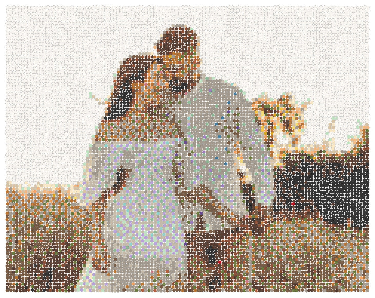
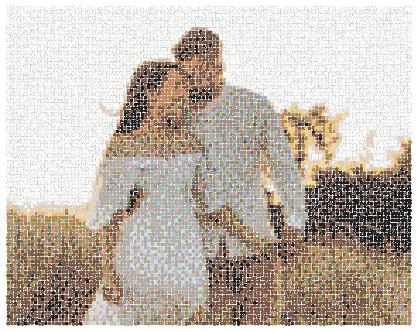
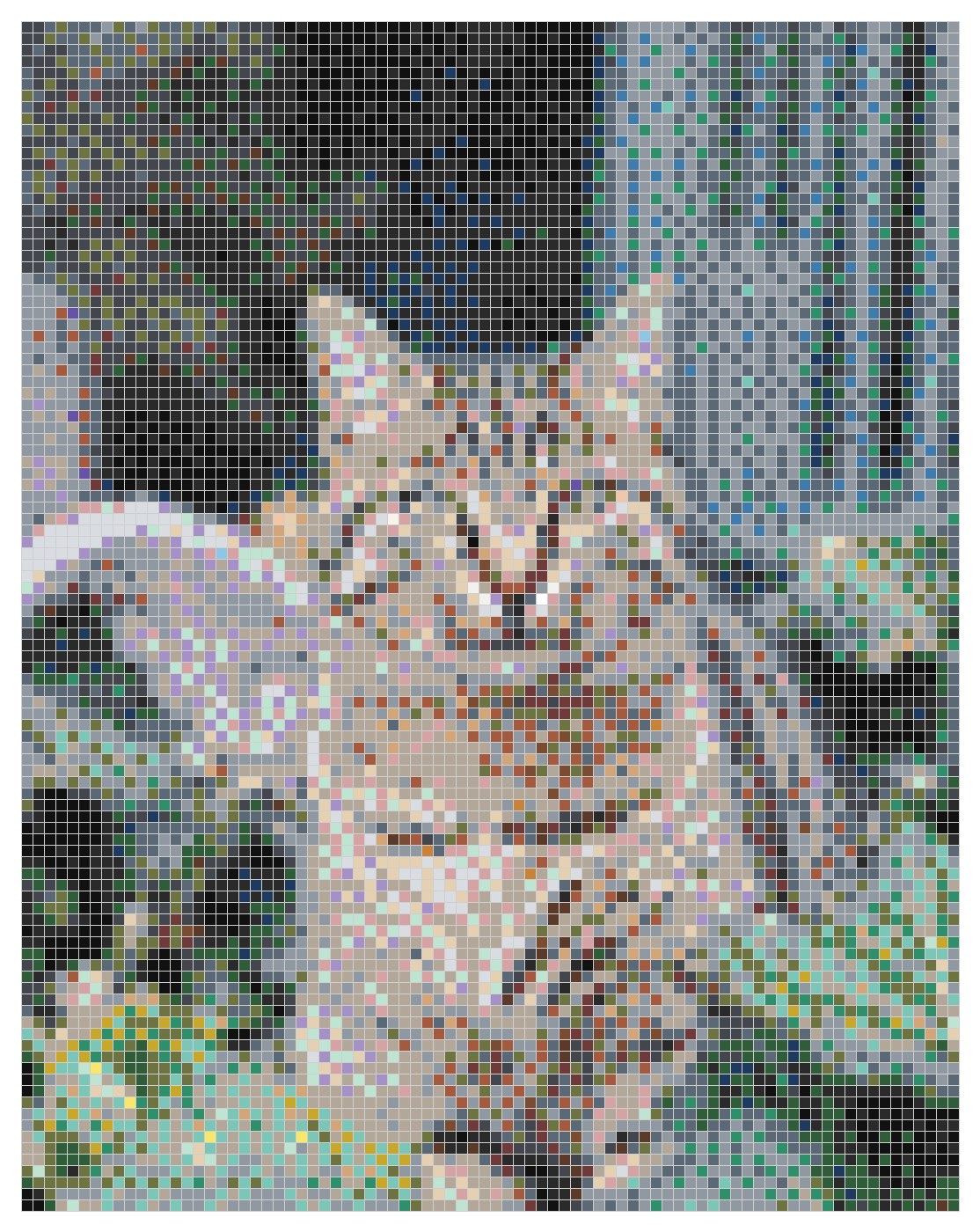
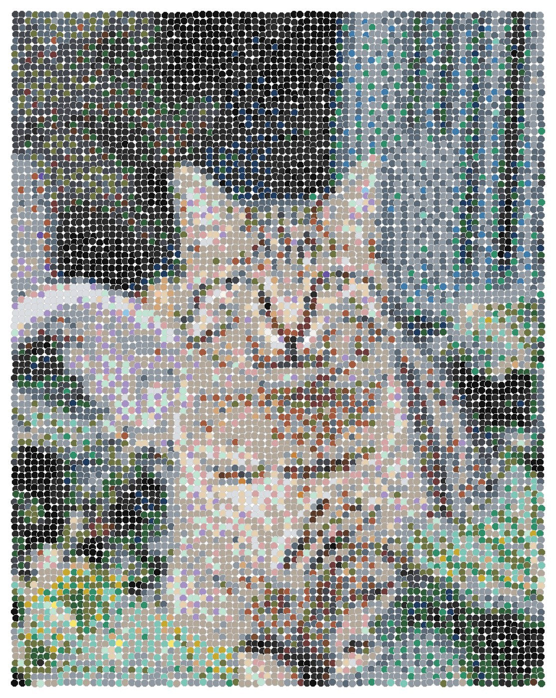
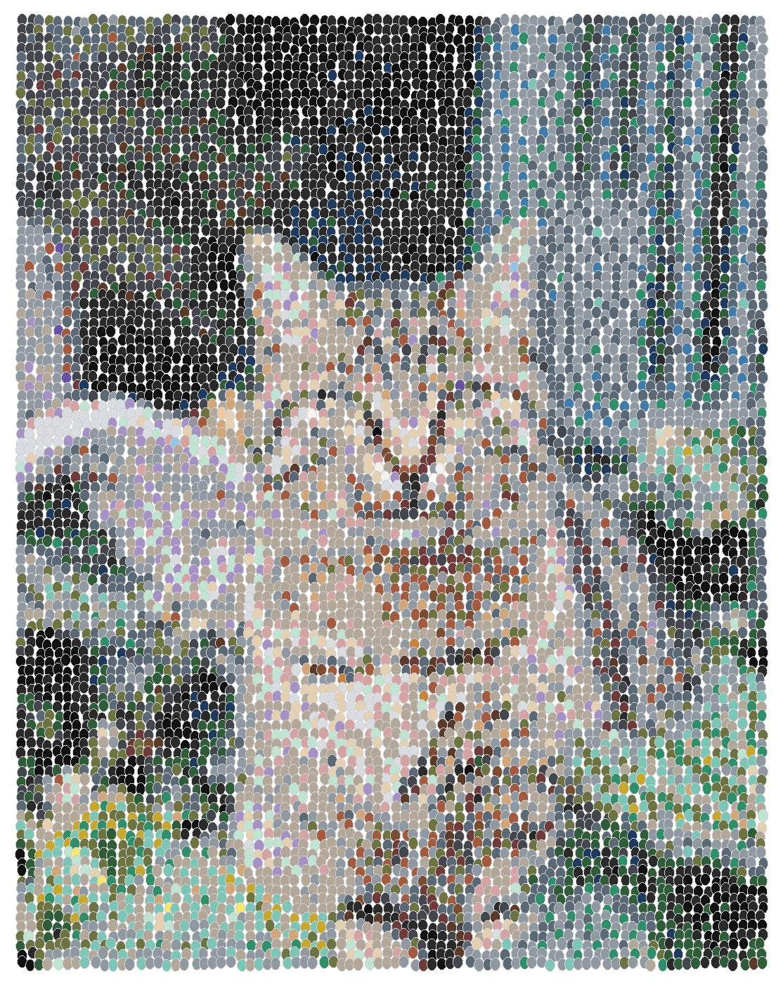
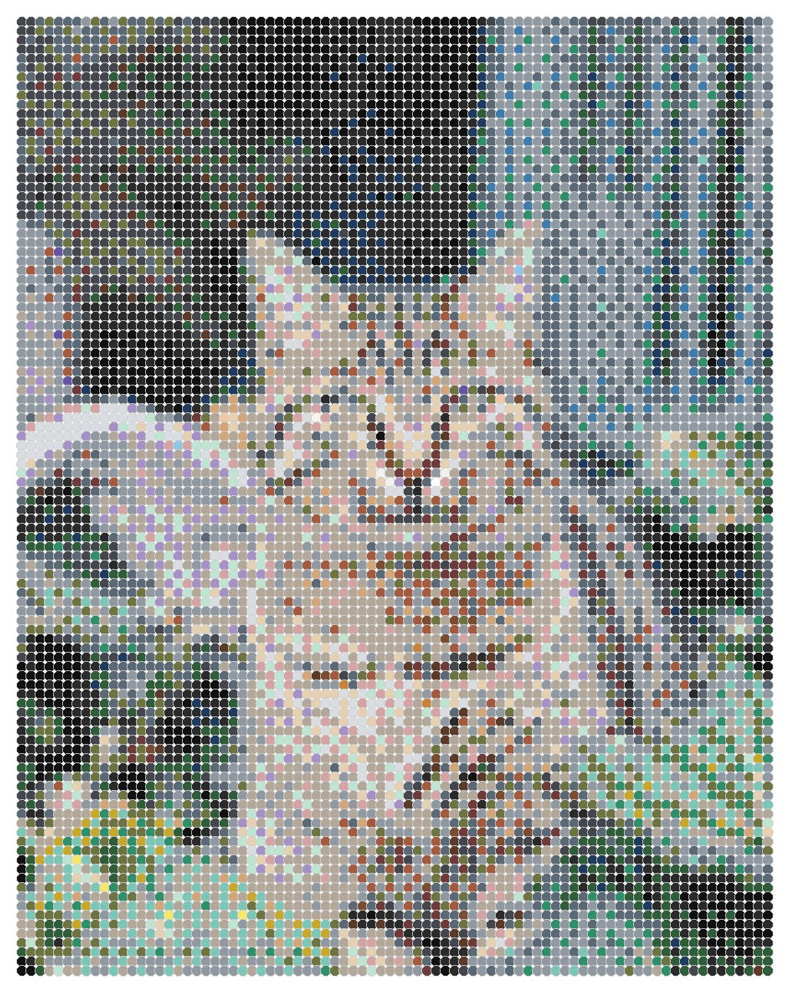
Bella is gentle, Vivo keeps fur detail, and Irregular Circles feel organic, while Packed Circles can make the surface feel richer up close.
Lumina feels bright and celebratory; Aurora adds intimacy for evening or cinematic photos.
Bella keeps it tender, Lumina keeps it clear, and Packed Circles can make the surface feel richer by hand.
Nordic is quiet and modern, Lumina feels clean, and Bella softens sentimental corners.
Soft palettes feel tender; rich palettes feel bold; framed options can make the finished piece feel more display-ready.
Which surface style fits my image?
It is not just a decoration. The surface style changes both how the finished piece reads and how the image feels to follow while painting.
Best when faces, keepsakes, or small details need structure.
Best when you want a more art-like surface without losing the subject.
Best for pets, portraits, and scenes that should feel loose rather than gridded.
Best for pets, landscapes, dramatic color, and art-object surface texture.
If your photo is...
Aurora adds atmosphere; Vivo helps hold contrast and detail.
Lumina keeps it clear; Solara brings warmth and energy.
Bella feels tender; Lumina keeps the result light and clean.
Solara celebrates warmth; Vivo keeps color and contrast lively.
Nordic keeps the room quiet; Squares add crisp structure, while Irregular Circles feel more organic.